
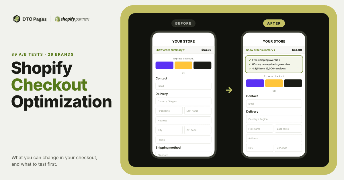
Shopify checkout optimization is improving the last step before someone buys, so more of the people who get there actually finish their order. Since 2022 we've run 89 checkout tests for 26 Shopify brands, and 46% of them won. The checkout is the last place where you can reinforce a shopper's decision, and there are plenty of ways to do it: credibility, social proof, guarantees, and more.
The checkout is also a chance to make each order worth more, with upsells or shipping protection that can bring in extra profit. As you'll see below, those are also the changes that most need testing.
But because it's such a sensitive place, we always recommend A/B testing any change you make to it whenever you can. Here are the tests worth running to improve your checkout's conversion rate, AOV, or profit. And if you don't have enough traffic to A/B test yet, use them as inspiration for the changes you make.
What can you change in a Shopify checkout today?#
The first thing to know is that what you can change in your checkout depends a lot on your Shopify plan.
If you're not on Shopify Plus, the checkout itself is mostly limited to branding: colors, fonts and your logo, from the checkout editor. You can also use apps from the Shopify App Store that run on Shopify Functions for discounts, bundles, and delivery and payment options. What you can't do is add your own blocks, like trust badges or reviews, to the information, shipping or payment steps. In that case, you'll usually get more out of optimizing the cart, the last step you fully control before checkout, and the thank you page, where you can add post-purchase offers. Shopify Starter is the exception: it supports neither Shopify Functions nor blocks on the thank you and order status pages.
Even on Plus, there's less freedom than there used to be. Since Shopify replaced checkout.liquid with Checkout Extensibility (Plus stores had to switch in 2024), you can no longer edit the checkout code directly or freely remove and reorder Shopify's native form fields. What Plus does let you do is add custom blocks to the information, shipping and payment steps, like trust badges, reviews or FAQs, and build custom apps with Shopify Functions, including validations on what shoppers can type in each field.
What can you change beyond the visual? Shopify Functions#
Shopify Functions let you change how your checkout works, not just how it looks. With them you can create custom bundles, set discount rules, decide which delivery and payment options show up, and validate what shoppers can type in each field. On Shopify Plus you can build them as a custom app. On other plans (except Starter), you'll need an app from the Shopify App Store that includes them.
It's worth separating this from the visual side. Most of what we build in checkouts are checkout extensions that show fairly simple elements: reviews, FAQs, trust badges, guarantees. Even simple blocks take more development work than they would on any other page of the store, and on the checkout steps themselves they're only available on Plus.
Functions are where it gets more interesting. One example is a bundle builder we built for ROYO: shoppers put together their own bundle from a set of products, and the checkout shows it grouped as a single item at the price the brand set, with the discount limited to specific products.
Other common checkout additions, like in-checkout upsells or shipping protection, usually come from an App Store app. That said, building your own is much easier than it used to be. With AI, an app that used to take months can now be built in a couple of weeks. If you're on Plus, a custom app doesn't need App Store approval. If you need a public app, add Shopify's review time on top.
What should you test first in your checkout?#
First, the obvious part: most of these changes won in our tests, but that doesn't mean they'll work the same way in your store. Every audience behaves differently, so we always recommend A/B testing them when you can.
We've been testing checkouts since 2022. When Shopify moved to Checkout Extensibility, testing inside the checkout got much harder for a while, until testing tools like Intelligems found a way to split traffic there again. Across all those tests, these are the changes we'd test first:
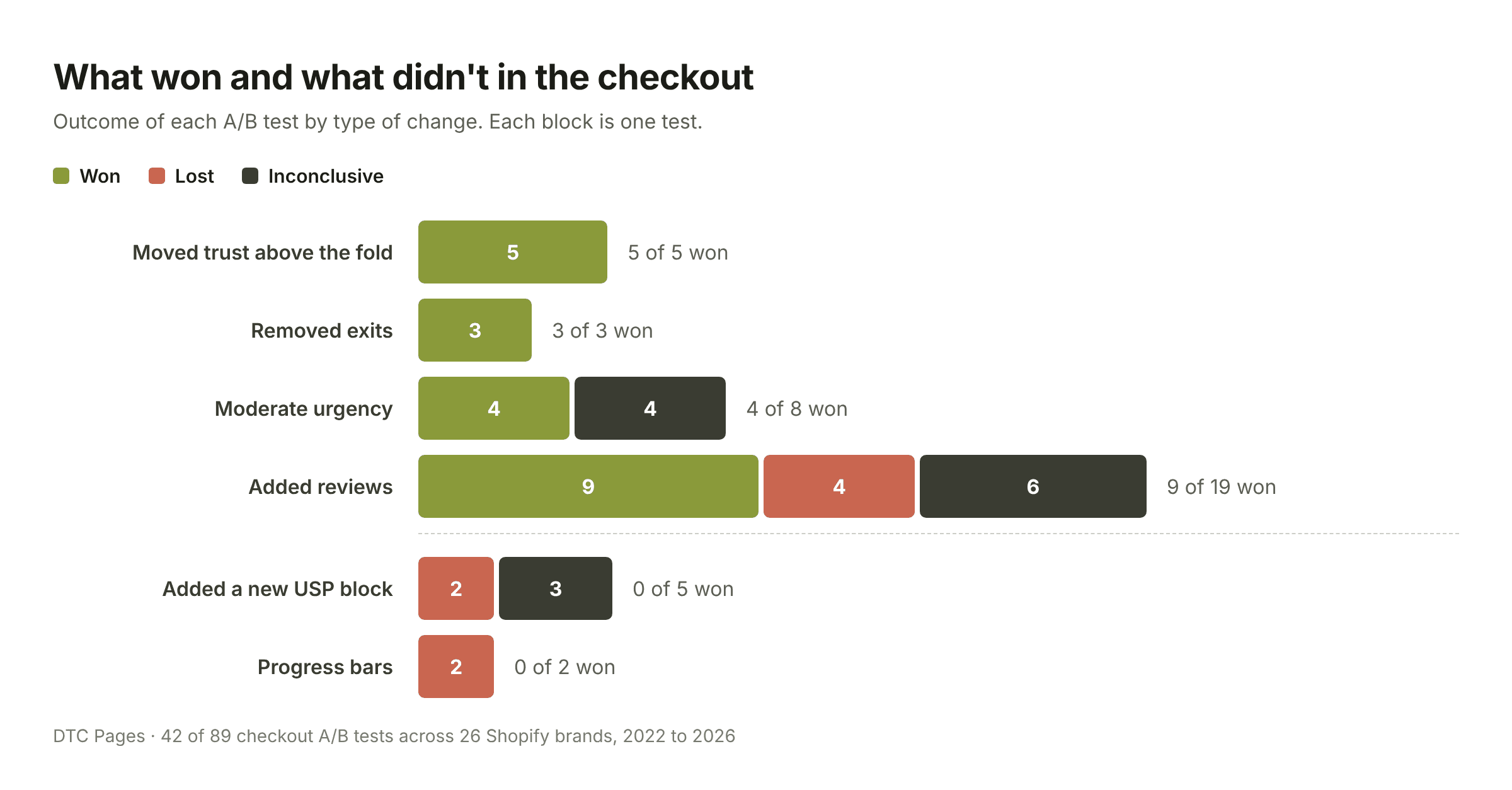
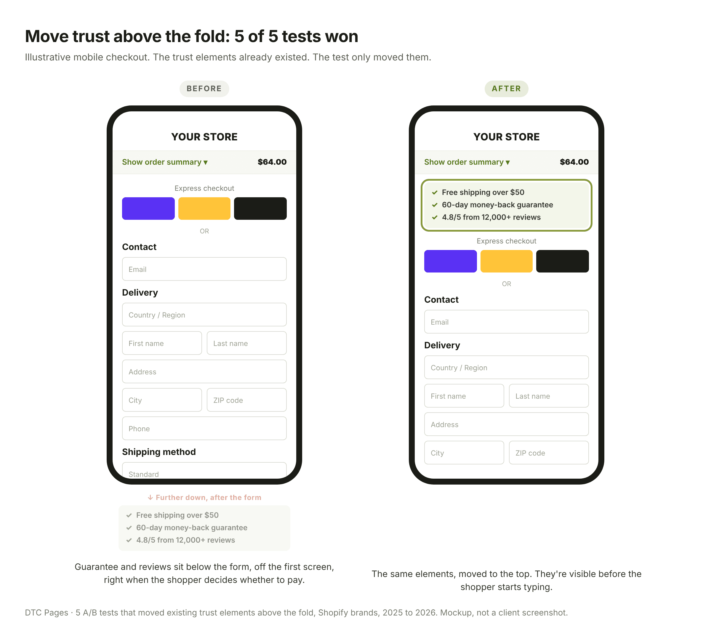
- Move trust above the fold, especially on mobile. All 5 tests where we moved existing trust badges, guarantees or USPs (like free shipping) to the top of the checkout won. On mobile, the form pushes those elements off the screen, right at the moment the shopper is deciding whether to pay. One caveat: in two tests, the same block that helped on mobile hurt on desktop, so check your results by device.
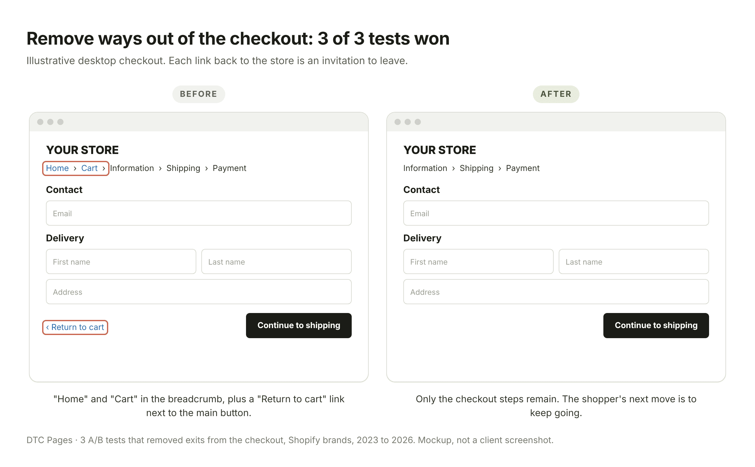
- Remove ways out of the checkout. 3 out of 3 won. In each one we removed something that pulled the shopper away from paying: a "back to cart" button, the "home" and "cart" links in the breadcrumb, or an extra reminder that interrupted the flow. The shopper stays focused on finishing the order. Every one of those is an invitation to leave, or at least to stop and second-guess.
- Add reviews, but keep them light. This is the change we've tested most, and it won 9 out of 19 times. What usually wins is a light format with short customer reviews. Heavier formats, like Facebook-style review blocks or press mentions, tend to do worse. Reviews also worked better on desktop than on mobile.
- A special mention for supplements. In the supplement brands we work with, adding social proof to the checkout won in 5 of 8 tests. With supplements, the shopper's doubt is usually "will this actually work?", and social proof answers exactly that. But the format matters: at one brand, removing reviews from the checkout is what won.
- Use moderate urgency. 8 tests, 4 wins and not a single loss. Think "your cart is reserved for 15 minutes" timers or low-stock messages, nothing too aggressive. Not everyone likes urgency, but our data says it's worth testing. If you're getting ready for Black Friday, we go deeper into urgency in our BFCM CRO strategies.
What checkout changes usually do not work?#
Same logic as before: these are the results of our tests, not a rule for every brand. Every one of these experiments started from a hypothesis, and an inconclusive or negative result for us doesn't mean it isn't worth testing in your store. In fact, we tested some of these more than once.
-
Adding a USP block. Adding something just for the sake of adding it often doesn't have the effect you want. The difference with the trust tests that won is that there, the elements already existed and we moved them above the fold. Here we added a USP block that wasn't there before, or in one case redesigned the existing one without moving it. We tried it 5 times and it never won, not even when the new block went at the very top of the checkout.
-
Progress bars. 0 out of 2. The idea was to use the "if I started something, I want to finish it" principle, with a checkmark next to each completed step or a progress bar at the top of the checkout. Both times, revenue went down. Showing shoppers every step they still have to go through, including a cart they can go back to, seems to weigh more than the feeling of progress.
-
Upsells. One of the most debated ones. When new clients start working with us and we get to the checkout, many of them ask if we can add upsells. The truth is we've had better results removing upsells than adding them: adding upsells to the checkout lost in the one test we ran, and removing them won 2 out of 5 times. That doesn't mean upsells have no place in the checkout, but you need to be careful and strategic about what you offer. The one time removing an upsell lost, it was offering a subscription.
With a few exceptions like reviews, adding things to the checkout usually doesn't pay off as much as removing them or moving them somewhere more strategic. By the time shoppers reach the checkout, they've pretty much decided to buy. Giving them reasons to keep reading, keep thinking or go back, like upsells or links to the homepage, ends up hurting more than helping them finish the order and bring in real revenue.
How big a lift should you expect from a checkout test?#
In our winning checkout tests, the median lift in conversion rate was +3.7%. 16 of the 23 winners that reported it won by +5% or less. Only three went above +10%, and each came with a catch: one ran for just a week, one won on desktop but trended negative on mobile, and in the third, revenue per visitor didn't rise with the same confidence as conversion.
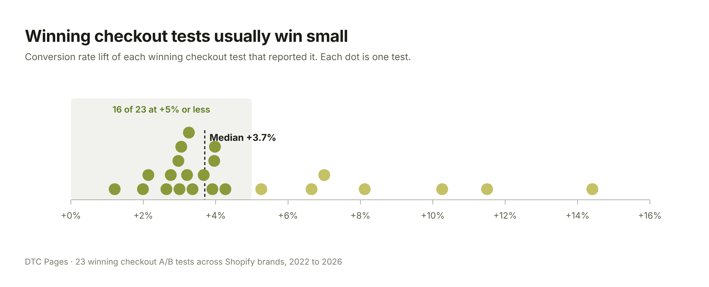
There's no magic change in the checkout. What you get is several small wins that add up over time. That's why we'd rather plan a series of tests than redesign the whole checkout at once. If you change ten things and conversion moves, you won't know which change did it, and the ones that hurt will hide behind the ones that helped.
Small lifts also need traffic to detect. A +3% change is hard to tell apart from noise unless enough shoppers reach your checkout, so check how much traffic you need with our statistical significance calculator before you start. And if someone promises you +20% from a single checkout change, be skeptical.
Which metric should you use to judge a checkout test?#
Look at revenue per visitor, not just conversion rate. Conversion tells you how many people bought. Revenue per visitor tells you whether the change made you more money. In the checkout, those two often move in different directions.
Upsells are the clearest example. When one brand removed the upsell from its checkout, conversion went up about 3%, but average order value dropped 1.7%, so revenue per visitor barely moved. At another brand, removing an upsell that offered a subscription lost revenue per session. A simpler checkout isn't automatically a more profitable one.
If the change touches shipping, shipping protection or discounts, go one step further and look at profit per visitor, because those changes affect what each order costs you, not just what it brings in. Shipping protection shows why: offering it won at a brand with a high average order value, while unchecking it by default, or not offering it to new customers, won at two brands with lower ones. Same feature, opposite answers. We go deeper into profit per visitor in our free shipping threshold tests.
About the data: 89 A/B tests on the checkout, checkout extensions, post-purchase offers and thank you page, run by DTC Pages for 26 Shopify brands between 2022 and 2026, most of them in the US and many in supplements. A test counts as a win when the variant had a 90% or higher probability of beating the control on conversion rate, average order value, revenue per visitor or profit per visitor. For how this compares with the rest of our experiments, see our A/B test win rate benchmarks.
Frequently Asked Questions#
What can I customize in Shopify checkout without Plus?#
Without Shopify Plus, you can change the checkout's branding (colors, fonts and logo) from the checkout editor, and use Shopify App Store apps built on Shopify Functions for discounts, bundles, and delivery and payment options. Custom blocks like trust badges or reviews on the information, shipping and payment steps are only available on Plus. The thank you and order status pages accept blocks on every plan except Shopify Starter, which supports neither those blocks nor Shopify Functions.
What checkout changes increase conversion?#
In DTC Pages' 89 checkout tests across 26 Shopify brands, the most reliable changes were moving existing trust badges and guarantees above the fold (5 of 5 won), removing exits like "back to cart" buttons (3 of 3 won), adding reviews in a light format (9 of 19 won) and moderate urgency, like a cart reservation timer (4 of 8 won, none lost).
How much can checkout optimization increase conversion?#
In DTC Pages' winning checkout tests, the median conversion lift was +3.7%, and 16 of 23 winners improved conversion by +5% or less. Expect a series of small wins rather than one big jump.
Do checkout upsells work?#
In DTC Pages' tests, removing checkout upsells did better than adding them: adding upsells lost in the one test we ran, and removing them won 2 of 5 times. The one removal that lost was a subscription upsell. Judge any upsell test by revenue per visitor, not conversion rate alone.
Should I add reviews to my checkout?#
It's worth testing. In DTC Pages' tests, adding reviews to the checkout won 9 of 19 times. Short customer reviews won more often than heavier formats like review sliders or press mentions, and reviews helped more on desktop than on mobile. In supplement brands, adding social proof won 5 of 8 times.
Want us to run this for your store?
We help 7- to 9-figure Shopify brands increase revenue through data-driven CRO. Book a free strategy call.
Ready to grow your Shopify store?
We help 7- to 9-figure ecommerce brands increase revenue through A/B testing, landing pages, and conversion rate optimization. No contracts, just results.